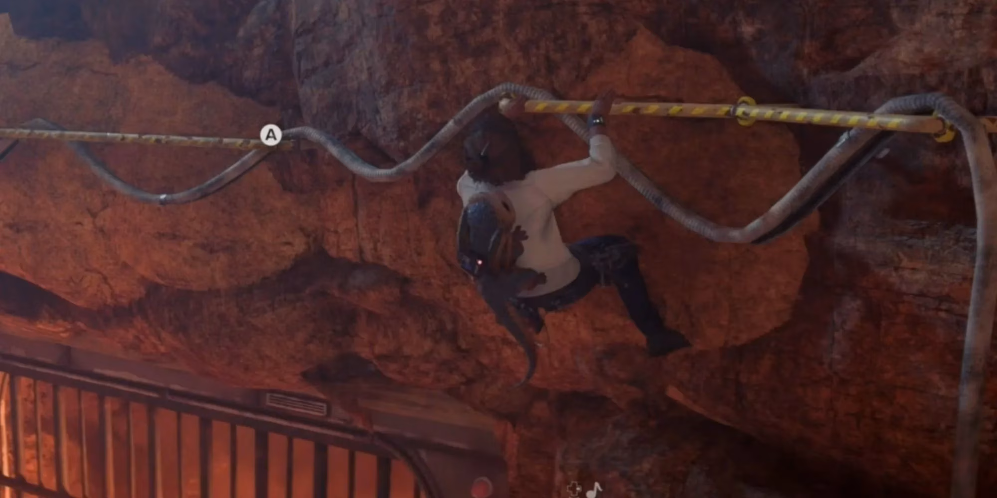
As I sit here in 2026, reflecting on my time with Star Wars Outlaws and countless other AAA titles, I find myself wrestling with a persistent design element that seems both ubiquitous and increasingly divisive: the yellow paint. My experience with Outlaws was genuinely immersive; it hooked me in a way few open-world games manage, making the game's middling review scores feel perplexingly out of touch. Yet, there it was, the familiar, customary daub of yellow on climbable ledges and interactable surfaces. The game offered an Explorer Mode to turn these hints off, and to its credit, it functioned perfectly well without them. This reliance on such a blunt visual cue, especially in sections clearly channeling the Uncharted series—the very franchise that popularized this technique—made me question why we've settled for this as an industry standard.
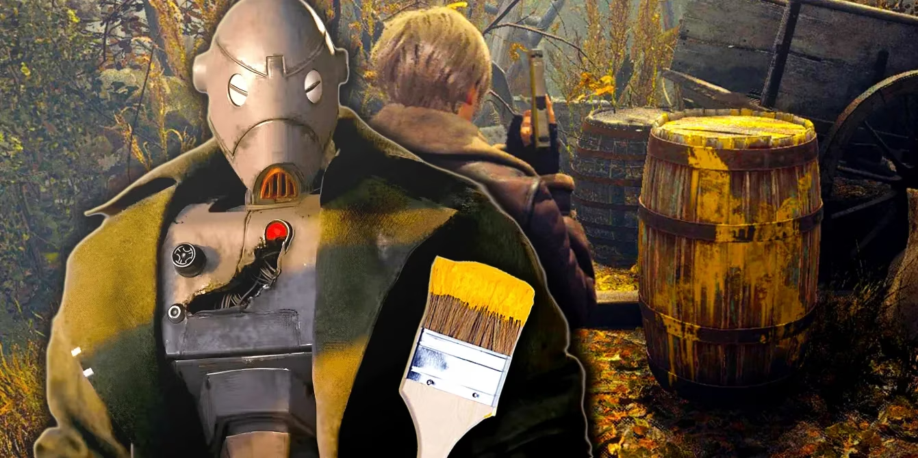
I understand the rationale. In an era where game worlds are more visually complex and dense than ever, a clear shorthand is necessary. The leap from the PS4/Xbox One generation to the current PS5/Xbox Series X|S era has blurred the lines between background dressing and interactive elements. Everything is a high-fidelity 3D model now. Modern remakes like Resident Evil 4 and Final Fantasy 7 Rebirth are testament to this, liberally applying their own versions of the "jaundiced varnish" to guide players through their meticulously detailed, and potentially overwhelming, environments. The paint serves a purpose: it cuts through the visual noise. But to me, it represents a failure of subtlety, a compromise that prioritizes obviousness over elegant integration.
The problem, as I see it, is that yellow paint occupies an awkward middle ground. It's as glaringly obvious as a UI pop-up, shouting "DEVELOPER HINT HERE," yet it's also diegetically part of the world, creating a dissonance. It feels like the game is patting me on the head with a really obvious clue instead of either outright telling me the mechanics or, better yet, trusting me to read the environment. Outlaws itself demonstrates there are superior alternatives, even within its own systems. When I approached a grapple point, a clean UI prompt would subtly indicate if I was out of range, changing only when I moved into the correct position. More impressively, the game used in-world visual language, like specific cross-hatching patterns etched into rock faces to denote climbable surfaces. These methods felt more respectful of my intelligence and more immersive.
So, what are our other options? I believe we have plenty, and the solutions aren't futuristic innovations—they're already here, employed by games that dare to think differently. We can learn from titles that mastered environmental readability years ago. The Dishonored series, for instance, had a brilliantly simple rule: doors with handles could be opened; doors without handles, featuring a ribbed metal surface, could not. A single glance provided all the information needed. For climbing, Horizon Forbidden West largely left its cliffs visually clean, then integrated the guidance into the character's toolset. Using Aloy's Focus (a form of detective vision) would temporarily highlight climbable paths with yellow lines, making the guidance a conscious player-activated choice rather than a permanent, world-breaking visual.
Sometimes, the answer is to gracefully sidestep realism altogether. Take Jusant from Don't Nod. This game is entirely about the meditative act of climbing a massive, mysterious tower. It uses no yellow paint. Instead, it communicates through clear, exaggerated shapes and textures: protruding rebar handles, large, obviously graspable rock formations, fantastical creatures that latch onto the wall and provide lifts, and bioluminescent branches that grow to create paths. Its more stylized, polygonal aesthetic certainly makes this easier, but there's no fundamental reason AAA games with realistic graphics can't leverage shape, texture, and exaggerated form with similar intent. We're already good at reading these cues. In Outlaws, I learned to gauge a wall's height for cover instinctively. I navigated the speeder bike through Toshara's rocky canyons by reading the landscape, not by following a painted line. I anticipated enemy attacks by watching the blaster in their hand, not waiting for a red reticle to appear.
Developers are already adept at this subtle communication, and we players are surprisingly skilled at picking it up. The reliance on yellow paint feels like a vestigial habit, a safety net that has become a crutch. It solves an immediate readability problem but creates a longer-term immersion problem. As we move forward, I hope to see more games embrace the principles already present in the best examples:
-
Integrated UI & Character Tools: Guidance as part of the character's abilities (Focus, scanner, visor).
-
Exaggerated Form & Texture: Using clear, intentional art direction to make interactive elements stand out through shape, not color.
-
Consistent Visual Language: Establishing world-specific rules, like handle-less doors or specific rock patterns.
-
Player-Activated Clarity: Giving players the tool to reveal paths when they are stuck, rather than painting them permanently.
The yellow paint will likely never fully disappear—it's too effective a tool for certain contexts and audiences. But it shouldn't be the default. It's the loudest, least elegant solution in our toolbox. In 2026, with the technical and artistic capabilities at our disposal, we can and should do better. We should build worlds that trust players to observe, learn, and engage with them on their own terms, using a visual language that feels born of the world itself, not slapped onto it. The path forward isn't about removing guidance; it's about weaving it into the very fabric of the experience, making the act of discovery feel earned and the world feel truly alive.